Spotify is one of the world’s most well-known music streaming platforms. Its green logo, clean interface, and minimalist design ensure a consistent user experience across its mobile apps, desktop software, web player, and marketing materials. Another visual element that often attracts attention is the Spotify Mix Font, which reflects the platform’s modern branding style and helps create a recognizable look across playlists, promotional graphics, and user-facing content.
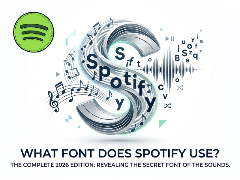
Many designers, developers, and brand enthusiasts often ask a simple question: What font does Spotify use?
The answer depends on the period you are focusing on and which part of Spotify you are referring to. Over the years, Spotify has used different fonts in its logo, app interface, and branding. Today, the company primarily uses a custom font family called Spotify Mix, which was designed specifically for its brand.
In How to Change Spotify Color to Pink, we have shared how to change the color of Spotify. This article will trace the development of Spotify’s fonts, introduce the fonts used in different regions of the platform, and explain why the company decided to develop its own fonts.
Spotify’s Current Font: Spotify Mix
Spotify currently uses a custom font called Spotify Mix, one of the company’s initiatives to create a stronger and more recognizable visual identity. For users wondering what is the Spotify font, the answer is Spotify Mix, a typeface designed to reflect the brand’s personality while also meeting the practical needs of its global digital platform. Rather than relying entirely on third-party fonts, Spotify developed its own font system to ensure consistency, readability, and a unique visual presence across different devices and markets.
Spotify Mix is designed to be seamlessly compatible with a wide range of devices, including smartphones, tablets, desktop computers, smart TVs, and web browsers. Since millions of users access Spotify every day using screens of varying sizes, the font must be clear and legible, whether it appears in playlist titles, navigation menus, or promotional banners.
This font blends modern geometric structures with subtle, human-like details. This balance allows Spotify to maintain a clean and modern look without appearing cold or overly technical. The final font is user-friendly and easy to read, so you won’t feel uncomfortable even after listening for a long time.
Today, Spotify Mix is ubiquitous in the Spotify ecosystem, appearing in everything from playlist names and artist pages to advertisements and Spotify Wrapped graphics. It has become a core part of the company’s design language, helping to unify applications, websites, and promotional content under a single visual style.
What Font Did Spotify Use Before Spotify Mix
Before launching the Spotify Mix font, Spotify used a variety of different fonts in its products and marketing materials.
One of the fonts most closely associated with Spotify is Circular.
Designed by Lineto, Circular is popular among tech companies for its geometric look and modern style.
For many years, Spotify has used the Circular font extensively in its branding and user interface elements.
Because Circular is so closely associated with Spotify’s visual identity, many people still believe that Spotify is using it.
Although the Circular font influenced Spotify’s design language, Spotify Mix eventually replaced it as the company’s primary font.
Why Did Spotify Create Its Own Font
Spotify created the Spotify Mix font not just to change the visual style. The company wanted to find a font that could support its growing global brand image and provide a consistent experience across all platforms. There were many key factors that led to this decision, including better readability, stronger brand recognition, and improved support for multiple languages. These design goals also help create a smoother experience for users across different Spotify products and services, including communities that discuss tools such as Spotify Mod APK latest version, where maintaining a familiar and recognizable visual identity remains important.
1. Strengthening Brand Identity
As Spotify expands globally, it becomes increasingly important to differentiate itself from its competitors. Using custom fonts helps create a unique visual identity that users can recognize at a glance.
Spotify no longer shares the same font with other brands, but instead uses a font closely related to its own image. This makes marketing campaigns, ads, and app interfaces more consistent and easier to remember.
2. Creating a Consistent Experience Across Devices
Spotify is available on many platforms, including:
- Smartphones
- Tablets
- Desktop computers
- Smart TVs
- Gaming consoles
- Car entertainment systems
Custom fonts allow Spotify to maintain a similar interface appearance across different screen sizes and operating systems. Whether users are listening on a mobile phone or a laptop, they will see a familiar interface.
3. Improving Readability
Millions of users browse the massive music library every day. They can search for songs, artists, albums, podcasts, and playlists in seconds.
Spotify Mix was designed to remain clear and readable in different situations, including:
- Small mobile screens
- Large desktop monitors
- Dark mode interfaces
- Bold headlines
- Small navigation menus
Good readability helps users find content faster and creates a smoother browsing experience.
4. Supporting a Global Audience
Spotify operates in dozens of countries and serves users who speak many different languages.
A custom font gives Spotify greater control over:
- Character design
- Language compatibility
- Symbol support
- Text consistency
This ensures that the interface looks beautiful and sophisticated to users around the world, rather than being primarily optimized for the English-speaking market.
5. Reducing Dependence on Third-Party Fonts
Commercial fonts typically come with licensing restrictions and ongoing costs. By developing its own fonts, Spotify can have more flexible control over how fonts are used in products and marketing materials.
This allows the company to:
- Control future updates
- Add new language support
- Adjust font weights and styles
- Maintain long-term consistency
What Does Spotify Mix Look Like
Spotify Mix belongs to the sans-serif category.
Its design combines elements of geometric and humanist typography.
Some noticeable characteristics include:
- Rounded shapes
- Open letterforms
- Balanced spacing
- Clear readability
- Friendly appearance
These features make it suitable for both large headlines and smaller interface text.
The font works well across playlists, podcasts, artist pages, search results, and marketing campaigns.
How Fonts Influence User Experience
The role of fonts goes far beyond simply displaying text on a screen. They directly affect how users interact with applications, websites, or digital services. A well-chosen font can make information easier to understand, while a poor font choice can cause frustration and slow navigation.
1. Improves Readability
One of the most important functions of a font is readability. Users typically skim through the content rather than reading it word for word. Clear letter shapes, appropriate spacing, and balanced proportions help people recognize words more quickly. In music streaming apps like Spotify, users often browse through thousands of songs, artists, playlists, and podcast titles. Easy-to-read fonts can reduce the time users need to find content.
2. Creates Visual Hierarchy
Fonts help organize information and highlight key points. Different font sizes, weights, and styles guide the user’s attention. For example, song titles might be displayed in a larger or bolder font, while artist names and album details might be displayed in a smaller font. This hierarchical structure allows users to understand information at a glance without feeling overwhelmed by information.
3. Strengthens Brand Identity
Typography is a key component of brand building. Just as logos and colors help users identify a company, fonts also shape a brand’s personality. Modern, minimalist fonts can convey a sense of innovation and simplicity, while more decorative fonts can give a completely different impression. Consistent font design helps users quickly recognize brands across apps, websites, ads, and social media content.
4. Enhances Accessibility
Excellent typography design can make digital products easier for a wider range of users to use. Clear fonts and appropriate spacing make reading easier for visually impaired people or users of small screens. Typography that prioritizes accessibility can enhance the user experience and ensure that information remains clear and easy to understand under different viewing conditions.
5. Supports Cross-Platform Consistency
Users frequently switch between smartphones, tablets, laptops, and smart TVs. A well-designed font system helps maintain a consistent user experience across all devices. Regardless of screen size or operating system, users are more comfortable operating the interface and experience less time to adapt to differences when the text looks the same.
Why Spotify’s Typography Works So Well
Spotify’s font design is successful because it balances readability, consistency, and brand personality. Users spend a significant amount of time browsing song titles, playlists, artists, podcasts, and recommended content. Difficult-to-read fonts can slow down navigation and make the interface look cluttered. Spotify Mix is designed to ensure that text remains clear and easy to read, even on the small screens of mobile devices.
Another reason for the success of Spotify’s font design is its clear visual hierarchy. Important information, such as song titles and playlist names, will be presented in a more prominent manner, while secondary information, such as artist names or other metadata, will be displayed in a smaller font size or thinner font. This helps users quickly understand what they are viewing without feeling overwhelmed by information.
The font also complements Spotify’s brand image. Music is an emotion and a personal experience, and Spotify’s font design reflects a balance between technology and creativity. The font is modern and simple, but it doesn’t appear overly formal or cold. This creates a friendly visual effect that perfectly aligns with Spotify’s goal of making music discovery simple and enjoyable.
Consistency is another important factor. The font remains consistent regardless of whether users access Spotify via smartphone, desktop computer, tablet, smart TV, or wearable device. This unified design language helps enhance brand awareness and create a smoother user experience across different platforms.
Spotify’s font design is geared towards users worldwide. The service covers multiple countries and supports multiple languages, so the font must remain clear and visually balanced across different writing systems. By developing Spotify Mix as a custom font, Spotify can better control how text is displayed globally, ensuring a consistent experience for users no matter where they are or what device they are using.
Conclusion
If you’re wondering what font Spotify is using now, the answer is Spotify Mix, a font the company customized to unify its brand image and product experience.
Before Spotify Mix, Spotify was closely associated with the Circular font, a popular geometric sans-serif font that helped shape the platform’s recognizable visual style. As Spotify expanded its ecosystem and branding needs, it moved away from Circular and introduced its own proprietary typeface to achieve greater consistency across products, marketing materials, and user interfaces. This transition also reflected Spotify’s broader focus on creating a unique brand identity, which extends beyond design to features that many users search for, including topics such as Spotify no ads, personalized recommendations, and a seamless listening experience.
This shift reflects a common trend among large technology companies: creating custom fonts to improve consistency, strengthen brand image, and support users using an increasing number of devices and languages.
While most listeners don’t pay much attention to fonts when enjoying their favorite playlists, Spotify’s fonts play a significant role in creating a familiar, modern, and user-friendly platform experience.